
Saree Colour Combinations: A Practical Styling Guide
Six reliable ways to combine a saree, border, pallu and blouse using colour relationship, contrast and proportion.
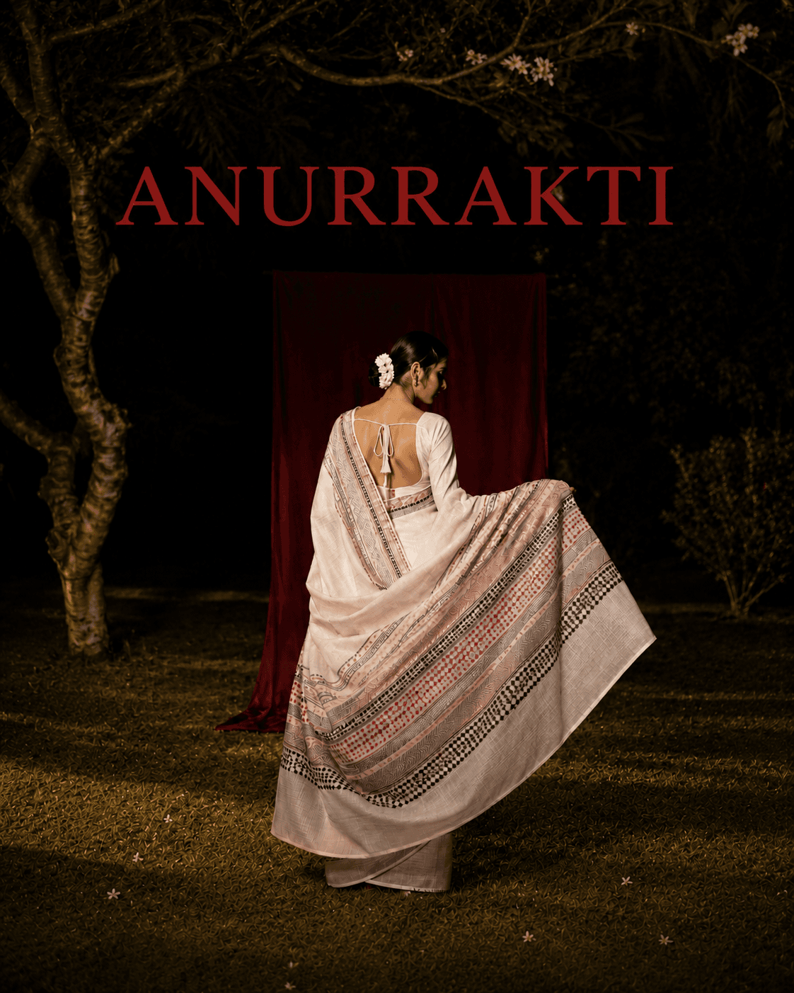
Colour works through relationships, not isolated names
Successful saree colour combinations are rarely about finding one approved shade. They come from the relationship between the saree body, border, pallu, blouse, jewellery and the setting around them. The same red can feel quiet beside burgundy, vivid beside ivory and warmer beside blue-green. Change the amount of each colour and the whole balance changes again.
Textile surface adds another layer. Matte cotton, translucent organza and lustrous silk can reflect and transmit light differently even when their colour names match. This guide uses hue, value, chroma and proportion to make those choices more deliberate while leaving room for culture, memory and personal preference.
Six terms for clearer colour decisions
01 / Hue
The colour family—red, yellow, green, blue and the transitions between them.
02 / Value
How light or dark a colour appears. Value contrast often remains visible even when hues are close.
03 / Chroma
How vivid or muted a colour appears compared with a neutral of similar lightness.
04 / Temperature
A useful relative description—one red may appear warmer or cooler when compared with another red.
05 / Proportion
How much visual area each colour occupies across the body, border, pallu, blouse and accessories.
06 / Surface
The lustre, texture, transparency and finish that change how colour is perceived in light.
Colour cannot be separated from material. Review the saree's fibre, construction and surface in our guide to saree fabrics before judging a palette from names or screen images alone.
01
Build a tonal combination
One hue family, varied value or chroma / Depth without a sharp break
A tonal combination repeats one colour family in lighter, darker, clearer or more muted versions. Think rust with terracotta, rose with wine, or pale blue with ink. Because the hues are related, the value difference becomes especially important: without enough light-dark separation, the blouse and saree can merge unintentionally.
This approach is useful when the textile already carries detail and you want the silhouette to read as one continuous composition. Place the strongest variation where you want attention—the blouse, border or pallu—rather than making every element equally intense.
Questions to test
- Can you still distinguish the blouse and border from the saree body at a distance?
- Which element carries the darkest value or highest chroma?
- Do the colours still relate under the venue's lighting?
02
Use neighbouring colours
Closely related hues / Movement with visual continuity
Neighbouring hues create a gentle transition: yellow into green, blue into violet, or red into orange. In a saree, this can connect a border to the body or allow a blouse to introduce a new colour without feeling detached from the textile.
The relationship becomes clearer when one hue leads and the others support it. If every colour has the same area and intensity, the result can feel busy. Repeat the secondary hue once—in the blouse, jewellery, piping or small motif—to make the decision look intentional.
Questions to test
- Which hue is dominant and which one supports it?
- Is the transition visible in the actual fabric rather than only in a digital swatch?
- Where will the secondary colour be repeated?
03
Create an opposing-colour accent
Distant or complementary hues / Energy and a clear focal point
Colours from different sides of a hue circle can sharpen one another. Blue with orange, red with green, or violet with yellow are familiar starting points, but they do not need to appear in equal, fully saturated amounts. A narrow green blouse or border can be enough to animate a predominantly red saree.
Control this combination through proportion and chroma. Let one colour occupy most of the look and use the other as an accent, or mute one side so the contrast remains present without becoming competitive. Metallic thread and jewellery can act as a bridge when they repeat a warm or cool note from both colours.
Questions to test
- Which colour is the field and which is the accent?
- Would muting or darkening one colour improve the balance?
- Does the border already provide enough contrast before a blouse is added?
04
Anchor colour with a neutral
Chromatic colour plus ivory, black, grey, brown or metallic / Focus and breathing room
A neutral can quiet a complex palette or give one colour more presence. Ivory beside vermilion, charcoal beside gold, or brown beside turquoise can make the chromatic element feel more deliberate because the neutral occupies visual space without introducing another strong hue.
Neutrals are not empty. Warm ivory, cool grey, blue-black and red-brown each carry a colour bias, while gold and silver change with material and light. Compare the actual textiles side by side; a neutral that works on screen may turn unexpectedly yellow, blue or reflective beside the saree.
Questions to test
- Does the neutral lean warm, cool or metallic beside the saree?
- Is the accent repeated in the border, pallu or blouse detail?
- Will the neutral fabric's texture support or compete with the saree surface?
05
Let the border or pallu lead
Extracted colour from the textile / A connected blouse and complete composition
When a saree contains several colours, begin with what is already present. Pull one minor shade from the border, pallu, embroidery or selvedge for the blouse. Repeating an existing colour often creates coherence while giving that quieter detail greater visibility.
Match by looking at the material, not by relying on the shade name. A printed coral, woven coral and glossy coral blouse may not appear identical, and they do not need to. Decide whether you want a close echo or a deliberate difference in value, chroma or texture.
Questions to test
- Which existing colour deserves more visibility?
- Should the blouse echo the colour closely or reinterpret it in another surface?
- Does the selected shade appear in enough places to connect the composition?
06
Edit a multicolour saree
Many hues, controlled repetition / Richness without equal competition
A multicolour saree does not require a multicolour blouse. First identify the dominant field, the recurring secondary colour and the smallest accent. Then decide whether the blouse should reinforce the field, elevate the secondary colour or isolate the accent.
Keep jewellery, bag, footwear and makeup within the same hierarchy. Repetition is more useful than exact matching: two or three appearances of a colour can make it feel intentional. If every accessory introduces a new high-chroma hue, the saree's own pattern may lose its focus.
Questions to test
- What are the dominant, secondary and accent colours?
- Which one should the blouse repeat?
- Can one accessory be removed to make the textile easier to read?
Five directions for the blouse colour
| Direction | What it does | What to check |
|---|---|---|
| Match the saree body | Extends the main colour and keeps focus on the border or pallu. | Make sure surface and value differences look intentional rather than almost-matched. |
| Repeat the border | Frames the upper body and connects the blouse to the saree edge. | Judge the combination after the border is pleated and draped at full scale. |
| Lift a minor motif colour | Brings a quiet woven, printed or embroidered detail forward. | Repeat that shade once more so it does not appear isolated. |
| Introduce an opposing accent | Creates a strong focal point and a more graphic look. | Control proportion; the blouse may be the only large area of the accent colour. |
| Use a neutral or metallic | Gives a complex saree breathing room or connects to jewellery and zari. | Compare undertone, lustre and texture under the event lighting. |
Once you select the colour direction, use our guide on choosing a saree blouse to resolve its fit, fabric and construction.
Test saree colour combinations before the event
- 01. Photograph the saree and blouse together in indirect daylight, avoiding a strong colour cast from walls or curtains.
- 02. Check the combination under the warm, cool or mixed artificial light expected at the venue.
- 03. Step several metres away and identify which colour attracts attention first.
- 04. View a grayscale photograph to compare light-dark value when the hues feel difficult to judge.
- 05. Drape the full pallu and border; small folded swatches can misrepresent the final colour proportions.
- 06. Place jewellery and accessories into the trial last, then remove anything that creates an unintended competing accent.
If the event has a dress code or community-specific colour expectation, check it directly. Then use the occasion guide to balance colour with venue, time, role and movement.
Follow the colour through
Choose the relationship that makes the whole textile come alive.
Explore ANURRAKTI's one-of-one sarees and see how body, border, pallu and surface build a complete colour composition.
Explore collectionsSources and further reading
Colour appearance depends on neighbouring colours, proportion, textile surface, lighting and the observer. Cultural meanings also vary by region, community and occasion; confirm any event-specific expectations rather than treating them as universal rules.
Continue reading
Related saree guides
The Saree Guide / 07
How to Choose a Saree Blouse: Fit, Fabric and Design
A practical guide to blouse fit, fabric, neckline, sleeves and finishing—built around movement and the saree you plan to wear.
The Saree Guide / 06
Saree Fabrics Explained: Silk, Cotton and Blends
A practical vocabulary for silk, cotton, linen, blends and man-made fibres—and the construction terms that are often mistaken for fibres.
The Saree Guide / 05
How to Care for Sarees: Washing and Storage
A careful guide to airing, cleaning, drying and storing sarees—built around the textile rather than one universal washing rule.